How to Add a Logo to a QR Code Without Breaking It
A logo in the middle of a QR code lifts scan rates, because a branded code looks deliberate rather than like something a stranger stuck to a lamp post. It also covers data. The trick is understanding exactly how much you can cover before the code stops working.
Why it works at all
QR codes carry Reed-Solomon error correction: redundant data that lets a reader reconstruct modules it cannot see. That is why a code still scans with a coffee ring on it. A logo is just deliberate damage, and error correction absorbs it the same way.
Four levels exist:
| Level | Recovers | Good for |
|---|---|---|
| L | ~7% | Screens only, no logo |
| M | ~15% | Clean print, no logo |
| Q | ~25% | General print, small logo |
| H | ~30% | Logos, packaging, outdoor |
How big can the logo be?
Keep it under 30% of the code’s width, and use level H whenever a logo is present.
The percentage that matters is area, and area grows with the square of width - a logo at 40% of the width covers 16% of the area, but it is concentrated in one place rather than scattered, which error correction handles worse than dispersed damage. In practice:
- Up to 20% of width - safe with level Q or H. This is the sweet spot.
- 20-30% - use level H, and test on more than one device.
- Over 30% - expect failures, especially on older phones or in poor light.
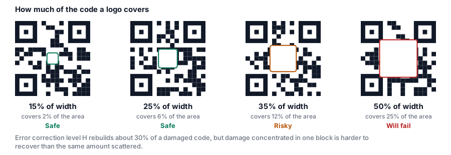
Our editor raises error correction to High automatically when you add a logo, and the scannability meter flags a logo that has grown too large.
Centre it, always
The three large squares in the corners are finder patterns; the smaller one is an alignment pattern. A reader locates the code by finding them. Cover any of them and the scanner does not fail gracefully - it never recognises there is a code there at all.
The centre is the only safe place. Anything off-centre risks clipping the alignment pattern.
Give the logo a margin
A logo dropped straight onto the modules blurs into them, and the reader has to work harder to decide what is data. A small amount of clear space around the logo - the “remove background behind logo” option in our editor - reads better and scans better.
Use a simple, high-contrast logo
The middle of a QR code is a small canvas. A full wordmark with a tagline will be illegible at 5 mm and will cost you data for nothing.
- Use a mark, not a full lockup. The icon from your logo, not the icon plus the name.
- Solid shapes beat fine linework.
- Avoid gradients that fade towards the background colour.
- Monochrome is often better. A single-colour version of your mark, in your brand colour, looks deliberate and stays legible.
If you do not have a suitable mark, our editor includes a set of simple glyphs - WiFi, mail, phone, calendar, location and others - that suit the space better than most corporate logos do.
Keep the contrast
Adding a logo does not change the rules for the code around it. Dark modules on a light background, contrast of at least 4.5:1, quiet zone intact. A brand colour that is too light will fail whether or not there is a logo in the middle.
Test it properly
A logo makes the code more marginal by definition. Test:
- on two different phones, one iOS and one Android
- from the real scanning distance
- in the actual lighting
- from a printed proof, not a screen
If it hesitates, shrink the logo by 5% and try again. That is almost always enough.
Step by step
- Open the QR code generator and enter your content.
- Go to the Logo panel and upload your mark, or pick one from the icon library.
- Keep logo size at or below 25%.
- Leave error correction at High - it is set automatically when a logo is added.
- Turn on remove background behind logo for a cleaner edge.
- Check the scannability meter reads Good.
- Export SVG for print, PNG for screens.
Your first download is free.